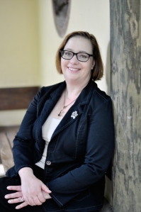
As the release date for How To Climb The Eiffel Tower approaches, I am gearing up to start talking to more and more people about the book. Part of that is putting together marketing materials that I can send people. This meant I had to have my picture taken. Few things give me the willies as much as looking at pictures of myself. I don’t know about you, but the woman I am in the pictures never looks like the woman I see as myself in my head.
Anyway, the charming Emilie Carol and I met in the Sarah P Duke Gardens on a steamy morning to snap some photos. It had rained the night before and was already hot and humid at breakfast time. Still, we soldiered on and got some nice shots.
Here’s where you come in. Which one of these photos is your favorite? If you saw this woman’s photo on the back of a book, would you want to read her books?
A.
B.
C.


A. A bit school teacher however what’s wrong with that? B Lovely C Also good but the colours in B suit better.
Exciting!!
I LOVE C….relaxed – thin! – best color! – young. A wonderful Elizabeth. A is way too old looking for a really young person. Love B as my second choice, which is also flattering, friendly, fun looking, great color. PS: Would definitely CROP C to get rid of some of the wall? you’re leaning against. Great results!
I can definitely crop C. I like B but I’m still not sure.
I really like A. But they are all fantastic!
Thanks, Amanda. That one seems the most “author” to me.
That’s what I thought too. Professional, but yet still warm, friendly, and approachable.
A looks like a ‘serious’ and ‘professional’ author which you are. B and C look like a friendly and caring person, which you are, too. All three are you (I’m saying this from my virtual and literary knowledge only, as you know), it depends on the type of writer you want people to see you as. The’re all great. A difficult decision 🙂
I think these turned out great! I think for an author photo, A or C. Love the colors and friendliness of B, but may be less “professional” and more casual cuz of the cute head tilt. Definitely crop the wall if you use C. I think I like A the best even though it’s more formal-ish, because your smile is wider–even though the general colors are darker (thus more serious), the smile balances some of that seriousness. If A, I still might crop the top slightly and mask out the wooden background thing in Photoshop. But it’d be okay even if not. Congrats on the lovely pics!!!
I think I will end up using A for formal purposes and B for more casual instances.
HEY! Great idea. 🙂
I like C, but would want to see more of you and less of the structure on which you’re leaning. Thanks for visiting my blog on the blitz.
C
I prefer C – if it’s cropped. B has nice colors but outfit is too casual. If you cropped B close enough (above chest), it would work because it would eliminate the too-casual look. All are great!
Thanks, Juanita. I think I will use B for more casual places, like Facebook and Goodreads, and use A and C for more official uses.
I really like A. I love the friendliness of B. And the framing of C is excellent. I agree with your thoughts on where/how to use them…
I think they are all lovely. A is more professional dressy and I like that. But if your book has more of a personal fuzzy connection that you are going for, I think the casualness of B and C work better.